You’re never too young to be house proud and, while…
How to Use Photos for Design Ideas
One of the more popular new innovations in interior design are online tools on websites where you can upload photos of troublesome spaces and either get suggestions and ideas from people all over the world (both design professionals and amateur enthusiasts) or use editing software to remake the room in a virtual studio. An example is showoff.com, however a quick online search will bring up many alternatives.

These are awesome tools and can be very helpful – but their effectiveness when trying to perform a DIY makeover in a space depends entirely on the photo you submit to the tool. The mistakes you can make when taking this photo are not always obvious, and can significantly impact the advice and design ideas you get back from both professionals and amateurs. Here’s a quick guide to ensuring that the photo you use for advice-seeking is set up correctly.
Go Big
The first and most obvious piece of advice is to make sure you take a photo at a high quality level. This will result in a larger image file, so check the upload requirements and limitations to ensure your final image file is small enough to upload and not be rejected. Essentially, you want the clearest, crispest photo possible under the size limitations, so experiment until you’ve achieved that.
Don’t Tidy Up
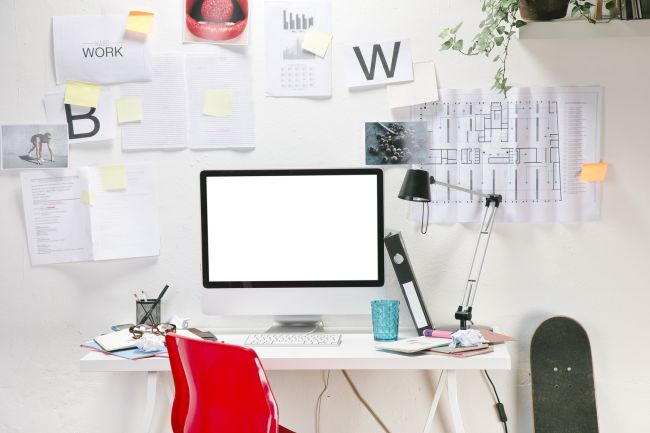
Resist the urge to clean up and arrange the room as if you have guests coming over and want to present your space ‘magazine-perfect.’ It’s much more useful for your online advisors to see your space in its natural state, as it is actually used. Any attempt to clean it up and make it look nice will introduce an element of artificiality that can corrupt the design ideas that you get.
Vary the Point of View
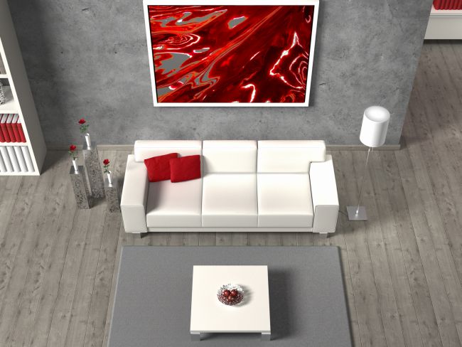
If you can only upload one photo, choose a point of view that approximates what people see when they enter the room – i.e., take the photo from the doorway. If you can upload multiple files, take shots from several vantage points. The more visual information they have, the better advice your online team can offer you. Again though, don’t be artistic with your angles as you would when photographing a room for sale or rent – give them a ‘neutral’ view of the room.
Offer Commentary
Don’t rely entirely on visuals. If the tool you’re using supports it, provide as much written information as possible about the problems you’re trying to solve, the ideas you’ve already tried, and your own aesthetic tastes. The more information you give, the better advice you’ll get.
In the end, online tools that let other people ‘play’ with your spaces and offer advice either as textual advice or literal makeovers of photographs are great tools – but the ultimate design decisions have to come from you. And if some of those design decisions include a few pieces of high-impact wall art, click here and let us handle that for you – we’re the experts.

